
Truth And Beauty: Putting a face on Big Data
You are a curious dev*, struck by the beauty of visualizations.
Those visualizations are multi-dimensional and interactive. They’re on the web. They’re like this yield curve of economic growth , or this market leader dashboard, or this racial census data of the United States.
And now you’re thinking, I want to do that! Is it hard? That’s a lot of data! What does it take? That’s where we were just a little while ago. Tremendously excited by the growing power of web and full of questions.
So we did some research to figure it out. We asked our colleagues, emailed the authors of the above examples, and read an awful lot. We also spiked it out, implementing it ourselves to test our solution. And now, we want to share our work!
In this article we will present our results. We will explain how to achieve data visualisation with a tech stack designed for Big Data** and we’ll justify our choices. We’ll show you a set of tools that allow interaction and 3D modeling in order to present data in the clearest, most engaging way possible. With this example architecture, we hope to illustrate feasibility and get you excited about “Big Data” visualization!
The Stack
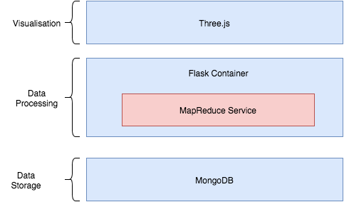
Our tech stack uses Three.js to power visualizations with data served by Flask, queried from a MongoDB instance. Let’s go through the layers.
Visualisation
What draws us to the visualizations is how clean and fun they are. They promise to take a massive, otherwise daunting sum of data and present it in a way that is digestible. Through them, we begin to perceive a pattern and are able to form a narrative.
One way to boost the understandability of visualizations is interactivity. It plays well to both visual and hands-on learning styles and invites curiosity and investigation. Looking at that dot map, you wonder, what are the racial demographics of my home town? And you zoom in to find out.
Another effective tool is 3D. It’s simple enough for our brains to parse, and beautifully done on the web. 3D visualization is greatly added by a little touch of interactivity - rotating the object helps us better suss out its shape.
In order to support the use of tools like interactivity and 3D, we need a powerful visualization platform. D3 is the most popular choice for custom visualization in the web. You can use it to build beautiful visualizations. D3 alone lacks the power to handle heavier visualizations, like interaction and 3D. For that, we chose Three.js.
Three.js is a cross browser Javascript library that allows for the creation of complex 3D animated graphics. The library can render your visualization using Scalar Vector Graphics (SVG), HTML5’s Canvas, and WebGL. But what makes it distinctive is its power.
The not-so-secret sauce for Three.js’s power is its native support for WebGL. WebGL allows us to make use of hardware acceleration for 3D meshes, running the rendering code on the GPU and freeing up the CPU for non rendering tasks like animation, physics or user interaction. This enables us to write those interaction and rendering-heavy visualizations.
Import the beauty of D3 into the a Three.js rendering canvas to have the beauty of both worlds.
Note: work with your friendly neighborhood stats-savvy UX designer (or ux-savvy data person) to come up with gorgeous understandable visualizations.
Nice! Beautiful, interactive visualizations, here we come. Now that we’ve settled the visualization platform, how do we get data to it?
Serving the data
Flask is a lightweight Python Web Framework that is simple to setup. Flask is to Python what Sinatra is to Ruby, easy to start hacking around but extensible and suitable for small applications. It comes with some nice features including RESTful request dispatching and a built-in templating engine in Jinja. RESTful request dispatching allows us to tailor our data processing requests making for interesting ways to interact with the data in the visualisation. The templating engine can be used to dynamical swap between views or make changes to the HTML without any round-trip AJAX calls. Flask’s simplicity is key for us here. We don’t need a big enterprise level framework getting in the way, we just need a framework that allows us to pass through the data, crunch through it and pass it on the frontend.
Data processing and Storage
This is where things get tricky. There are a lot of technologies out there that can handle processing massive amounts of data. You might have heard the words ‘Hadoop’, ‘Cassandra’, ‘Spark’. Hadoop especially has become synonymous with big data processing and has become a defacto standard with offerings like HortonWorks and Cloudera. The key for us however, is having fast access to our data in order to keep the visualisation interactive. Equally important for this article is a fundamental understanding of one of the flavours of Big Data processing, Map-Reduce. MapReduce is an implementation of the programming paradigm of the same name, used to parallelise the processing of large volumes of data. This can be easily implemented in Python or R without complex setup needed for Hadoop and its ecosystem of technologies. For this reason we chose to implement a simple MapReduce algorithm tailored for our data set. Just enough in order to visualise it!
How do we store our data while maintaining a similar data model, specifically JSON, across our stack to make it easier to handle? This is the question we asked ourself before deciding on a data store. We settled for MondoDB, a NoSQL document based database. Easy to setup and insert our data, and scaleable for large data sets. And there is more! MongoDB offers great drivers for not only Python, but Node, C++,Java,C#. Ripe for polyglotting! So now we have MongoDB as our store, Python doing our Map Reduce all this being served via Flask to our fronted for visualisation.
Take a look at our tech stack again! We put it here to save you the trouble of scrolling back up to the top

Conclusion
Big Data has become an incredibly important part of many large organisations to maintain a competitive edge over rivals by narrowing down their customer base and tailor services to their needs. It has become a major driving force, inspiring breakthroughs in multiple disciplines like medicine, finance, astronomy, physics and computational life sciences. Harnessing the power of the vast amounts of data almost always involves modelling an effective visualisation platform that can find the proverbial needle in the haystack. Human beings are far better at noticing patterns while computers excel at analysis and computation of large data sets. A combination of human inquiry stimulated by effective visualisations and the processing power of computers makes for a potent weapon for not only researchers in multiple fields but decision makers in organisations. Advances in web technology, specifically browser optimisation, have made it possible build complex multi dimensional visualisations in the browser, a much more accessible platform than the traditional proprietary visualisation tools.